Showing posts with label illustration. Show all posts

Monday, November 29, 2010

When the bee stings.....

As we bid farvel (as they say in Denmark) to Cyber Monday 2010, here are a few of my favourite (online) things:

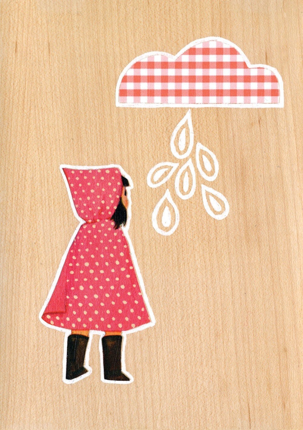
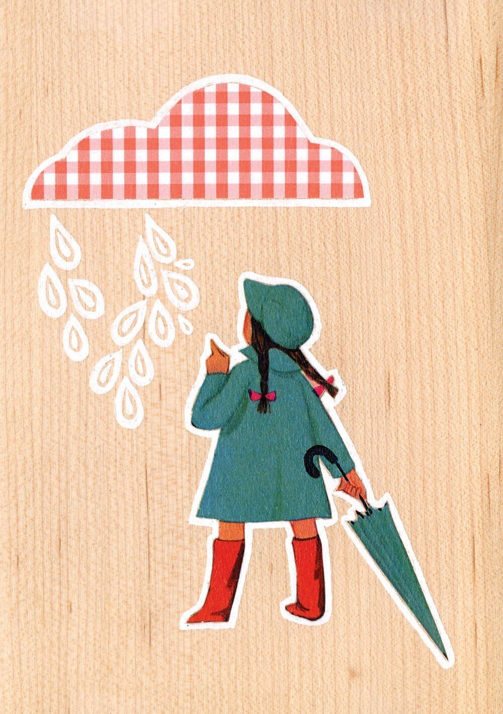
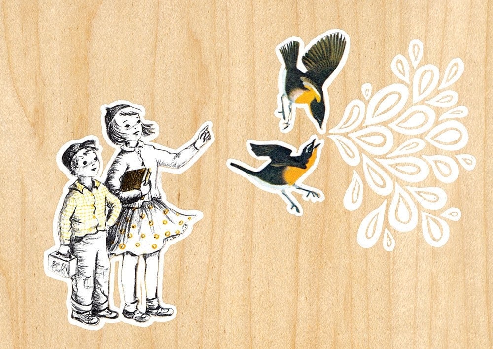
Happy Bee Day Cards by ZenBrush

Gorgeous Danish Ormaggio vase by Kahler

Concrete platter by ImpureVessels

Sunday, April 4, 2010

Featured Artist: Shirley Ng-Benitez

Ever since my introduction to the blogging world in 2008, I have crossed cyber paths with countless interesting, artistic, friendly and supportive people. Illustrator Shirley Ng-Benitez is one of them, and I've recently had the pleasure of interviewing her about her work and other fun facts.

KP: What 3 words would you use to describe your illustration style?

SNB: Wow, this is a tough one, as I'm still figuring it out - though I would say, 1) story-like 2) heartfelt 3) warm


KP: Do you have an illustration that is especially close to your heart?

SNB: I have two: La Partie de Thé dans le Bois (http://shirleysillustrations.blogspot.com/2010/01/miette-and-tea-party.html); and "Monsieur Olivet" (http://shirleysillustrations.blogspot.com/2009/10/fallits-here.html). I feel that the first one is special to me because the sketch came from a thought from a lovely friend and I just started sketching the idea out quickly. Miette's face came first and then the party crowns, the tea, and the whole forest scene came to life. I just keep sketching and everything just came out so fluidly...that is something that doesn't happen very often for me. Monsieur Olivet is very special to me because of his expression. This expression just "spoke" to me and he came to life one day. I found the "right" name for him, and he is off on his adventures. It has been such a treat to come up with his friends and story..which is still unfolding, by the way.


KP: An artist/illustrator whose work you admire?

SNB: Oh so very many that I can't say just one..can I name a few? Holly Hobbie, Amy Bates, Lisbeth Zwerger, Maurice Sendak, R.W. Alley. So very many more!


KP: Please tell us a bit about your artistic process, from concept to finished artwork.

SNB: When there is a problem to solve visually, there is an initial period where I have a few immediate thoughts about how to go about illustrating the piece, and so I quickly sketch out ideas on regular bond paper. After I sketch a few ideas, I move on to my daily chores and work-load all the while thinking about the problem. I tend to work on my illustrations at night when all is quiet in the house, and when there's time to think. Each night, before I go to sleep, I sketch. I think this has helped me a lot this past year, feeling more comfortable with just letting the pencil go. I erase a lot, and keep sketching facial expressions, poses and environments until I get to a point where there is a special something that I see in a sketch. Then I get pretty excited, and eager to work through all of the details to enhance the entire piece. Once I'm happy with the sketch, (and hopefully have succeeded in solving the visual problem), I define the sketch more with detail. Not a completely detailed piece, but I add enough detail so that I can then move to the next phase, which is to photocopy the sketch and enlarge it by about 150%. I tend to sketch small, so I blow up the sketch so that when I paint, I can add a bit more detail. Once the copy is made, I turn it over and add graphite all over the back so that I can transfer the copy to a watercolor block. I use Arches Cold Pressed 140lb. currently because I really like the texture of the paper and enjoy the format (12 1/8" x 15 1/8"). Once the pencil is transferred to the watercolor block, I wet the entire area I'm going to paint on with plain water and let it dry. Sometimes I float color into the backgrounds at this stage and leave it clear where I might place a character or animal. Then I start laying in color here and there in light washes. I move back and forth between focusing on the main character, or the background as I find that I like the differences (detail work, and then soft washes). I start adding fine detail with my favorite 00 Winsor Newton Sable brush throughout. I really enjoy the whole process...and it's always hard to know when to stop..but I'm hoping I'm getting better at knowing when. I am still a student, that's for sure!


KP: What have you found to be the greatest challenge as an illustrator? What is the greatest reward/Why do you love what you do?

SNB: Greatest challenge: overcoming self-doubt. I have always loved drawing ever since I can remember. I drew all along the sides of my papers as a kid, and would always scrunch up and cover my work as a child. Even after finding my direction in college, I remember hesitating to show my work to the class for any sort of critique. It was much too personal and I remember feeling that to show my portfolio to anyone was like wearing my heart on my sleeve. It was SO hard to break through that self-doubt and fear of rejection.

The greatest reward is to have my girls respond with a verbal, "Awww!". (Extremely awesome when you're aiming for illustrating something sweet and cute!). I just asked my little one to help with question 1, and she said, "what does that mean?". After I said "what does mommy's work look like to you?", and she said, "it brings you into the forest". Heck, I was just so tickled to hear that because that's what I'm shooting for - bringing people into my work and having them feel as though they've just been transported to a childlike world again..full of innocence, light, and fun. I love to illustrate because it brings me such joy to be able to send a cheerful break to anyone who might chance upon a piece. I believe in living each moment to the fullest, to stop and smell the flowers, and enjoy what nature brings us, so when we can pause a bit in our busy day to relax and ponder, it makes me happy to know that my work might be a part of that levity that we all need.


KP: As a child, what did you aspire to?

SNB: I always wanted to be a veterinarian and own a horse. I now, crazily have a barn but no horses, just a dog, a fish, and lovely family. And up until my first year in college, I thought I was going to be an Engineer, just like my dad. Thankfully he has been so supportive of my quite-the-opposite career direction.


KP: What do you do in your spare time?

SNB: I walk the dog; ride my bike; in the spring through summer I enjoy pretending to play golf; love to bake and cook; read about the illustration industry and about artists, illustrators, lettering-artists, and designers of the past and present; crochet scarves, sketch, sketch and sketch some more. I also love chatting with my girlfriends and catching up with my favorite blog friends and artists!


KP: Chocolate, Strawberry or Vanilla?

SNB: Chocolate - all the way. Especially dark of any kind.

(Love this lil' guy)


Find Shirley's work here (illustration blog) and here (graphic design website).

All images copyright Shirley Ng-Benitez.

Sunday, March 28, 2010

Illustration Friday: "Rescue"


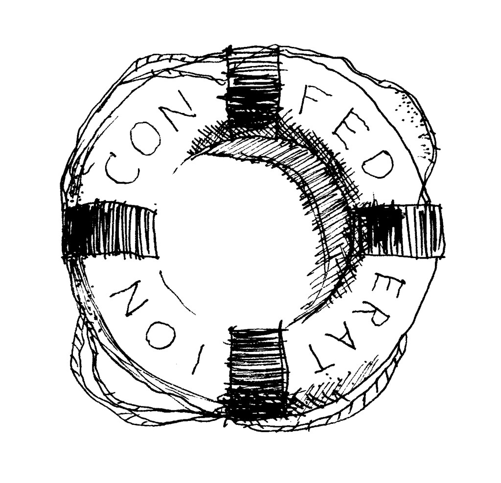
Scott is from Prince Edward Island, so when we got married we named our tables after places from his home province (which those of you who are Canadian and paid attention in grade 11 Social Studies will recognize as the birthplace of Confederation. Actually, that had to have been the most boring subject in high school, right? It may have had something to do with my teacher, who was about as dry as stale bread. I'm sorry Mr. Machonachie, but I have to use your name here in order for the next part of this story to make sense. But for the record, I liked you, I really liked you!
Mr. Machonachie was a very nice person, but the poor guy was not exactly known for painting vivid pictures of the past for his students' educational delight. But in his defense, COME ON, Sir John A. MacDonald would not likely have made Barbara Walters' Most Fascinating People list. Anyway, the highlight of the term was when one of my classmates brought in a Chia Head (if you click on one link in this post, may it be this one) and we cultivated it on the windowsill for weeks, affectionately referring to it as the "Machonachia". Back in those days, we could not have cared less about Confederation).

But I digress.

Charlottetown, Little Sands, Cavendish, Beach Point and Flat River, are just a few of the lovely little spots in PEI that we named our dinner tables after.
We included corresponding illustrations on each table card, and the illustration above was for "Wood Islands", the spot where you catch a ferry to Nova Scotia.
And here is "Charlottetown":
And now I am off to make a Sunday night apple pie for that very same husband....


Sunday, March 14, 2010

Featured Artist: CABIN + CUB


My home office renovation is almost ready for its grand unveiling - and it is a HUGE improvement. I'm doing all the fun stuff right now like organizing bookshelves and deciding which art to hang on the walls. I'll post photos as soon as it's complete!

In the meantime, I'll be eagerly watching the mailbox for two prints and an original collage (pictured above) from cabin + cub. Owner and designer Valerie Thai is a Vancouver-based graphic artist and illustrator. Her popular collages feature illustrations from vintage children's books as well as her own creative embellishments.

I can't remember how I first stumbled upon cabin + cub, but I've been admiring this shop on Etsy for quite awhile. I'm pretty sure the name had me at hello because I'm instantly drawn to anything that conjures up thoughts of coziness, and who doesn't love cabins and who doesn't love cubs? But of course, Valerie's beautiful work was the real reason I became a fast fan. These collages aren't just for kids either, I plan to hang mine in my sparkly new office!

See more cabin + cub here and here.


oh and p.s. : remember a few weeks ago I mentioned an exciting giveaway involving Koo & Poppet and Big Fat Hen? Well it's JUST AROUND THE CORNER......as in this week! Check back in a few days.....

Sunday, January 24, 2010

"Help is a Verb"

“Help is a verb” – we have one world and our neighbor is crying. By Michele Bedigian.

I love the ways of the worldwide web.

The online exchange of information is so astonishing to me, especially at a time like this, with so many people in need of so much.

Think of the ways of the world 20 years ago; information technology was not nearly what it is today (I know, duh). There wasn't really an internet (or at least, the majority of the world's population didn't know how to use it and even if you did, it took ten minutes to load a page) and there was no texting, no instant messaging. When fundraising efforts were in high demand, we relied on toll-free numbers, snail mail and in-person donations. Not to say there's anything wrong with those methods, but here and now in 2010, we can press a button and send help on any scale.

I guess what got me thinking about this is that I realized that 90 percent of what I know about Haiti's current humanitarian situation has come from the internet. And 90 percent of that 90 percent has been information about relief efforts. Where to click, what to text, how to help.

There is one effort in particular that I would like to highlight and, not surprisingly, I found out about it online, from local designer Beth Campbell of bethcampbellcreative.

What it is: for every $50 donated to CARE for Haitian relief efforts, donors receive a limited edition, signed 13" x 19" illustration by the one of the STUDIO 1482 artists.
Click here: OneDrawingADay (see, it's that simple!)

Art at its best, that for a cause.
“Hispaniolan Trogan” – Drawing/collage of the national bird of Haiti, the Hispaniolan Trogan. By Greg Betza.

Thanks to Beth for the info.

Friday, January 15, 2010

Featured Artist: MINU


Based in New Zealand, Minu is an illustrator and a toy maker. I am in love with the little stuffed creatures (Bous) and how their ears seem to blow in the wind.

Sunday, January 10, 2010

Featured Artist: Naoko Stoop


I thought I'd add a new segment to the blog this year. Every so often I'll feature artists whom I've stumbled upon via the web. I've marked so many as favourites on Etsy to be revisited later, and this is a perfect way to ensure I do so.

The first featured artist is Naoko Stoop who was born in Tokyo but illustrates from her home in Brooklyn, New York. She writes on her website: "My artwork comes from the everyday life in my neighborhood....Most of the materials I use are from the neighborhood...Since I was little, I was fascinated with creating things on used paper....'brown paper bag collection' came from this fascination. I use used and folded brown paper bags as my canvas....Drawing living things is central to my exploration of life. Combining this with painting, collage and printmaking, I am trying to create images that project the beauty in life."

I think her work can be enjoyed by both children and adults, and several of the pieces would complement each other in triptych form. I imagine them looking beautiful in a gender-neutral woodland nursery....but then, I'm biased!

I've always believed that working with collage requires a kind of deliberate sentiment, if that makes any sense, though I'm not sure it does. Nonetheless, there is a certain something in the quality of her work that convinces me she must be a sincere and gentle person, and who doesn't love one of those?

Visit her website here to see more

Friday, December 11, 2009

Illustration Friday: "Hatch"


Not my usual style, but I had to participate considering this week's topic was suggested by moi!

Monday, November 30, 2009

Trim the trees, it's December!

This is me right now - wrapping packages of misfit toys and sending them far and wide.

Except I don't have a piping hot chocolate on my desk like this Elfcat does. 

That's okay though, I have already seriously overdone it on the eggnog lattés this year!
(B - am I right or am I right??)

Saturday, November 21, 2009

Illustration Friday - "Music"

It's been awhile since I've had time to do some drawing and painting. I dug up these half-finished illustrations for the sake of this week's Illustration Friday topic. For anyone out there who has no idea what I.F. is, it's "an online weekly illustration challenge. A topic is posted every Friday and then participants have all week to come up with their own interpretation."

This week's topic is Music. Here is PimCat, balletically putting away her groceries to Tchaikovsky's Nutcracker Suite. She simply cannot resist the urge to arabesque with a can of peas in her paw.

Same cat, different day, musical nonetheless:


Wednesday, October 28, 2009

Lost and Found by Oliver Jeffers


Has anyone read Lost and Found by Oliver Jeffers? It is a simply beautiful children's book about a lonely penguin and a determined boy. The illustrations are stunning. 
Well, the book has been adapted into an animated film! First Where the Wild Things Are and now Lost and Found. I'm so happy that great children's literature is receiving the recognition and esteem that it deserves.
Thank you to tiny&little for originally posting about this!

Sunday, September 20, 2009

Dancing Bear for Sunday's end


I quite adore this Dancing Bear print by Emily Martin, a.k.a. The Black Apple.
Her talents and imagination are limitless. Just thought I'd share it this Sunday eve.

Saturday, August 22, 2009

Illustration Friday - "Caution"

CAUTION:

"THE FOLLOWING PROGRAM CONTAINS SCENES OF CAR RIDES, BATHING, LARGE DOGS, FLEA COLONIES AND NIP USE, AND IS NOT SUITABLE FOR KITTENS. VIEWER DISCRETION IS ADVISED."

Tuesday, July 28, 2009

Cat on a Wire by echarrow


What's not to love about this mischevious cat on a wire? I love his scraggly claws the best (click to enlarge). And I love the tail feathers. And the off-kilter eyes. And the unlikely traitor. See more in echarrow's Etsy shop.

Sunday, July 12, 2009

Illustration Friday - "Hollow"


Okay, so this is more of a sketch than an illustration, but here's my second submission for Illustration Friday (two in three weeks, not bad, I say!)
This week's topic is Hollow. 

Wednesday, July 1, 2009

Illustration Friday - Worn


I've wanted to participate in Illustration Friday for so long now! Here's my first submission, "Skipping Away".

(some of you may have seen it here)

Tuesday, June 9, 2009

New Mailing Labels

This is a draft of a mailing label I've been working on for those orders that come from far off places. I like the sketchy quality and the little banner design, but I'm wondering if it's a bit confusing to switch up the graphics and stray away from the original K & P logo (as in the masthead). Maybe I should just keep things consistent? I welcome any advice!